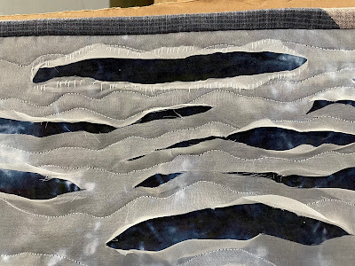
As I worked with my quilt, Magma: Undercurrents, I thought I had stumbled upon a new way of working, one that I could keep exploring: layering silk organza over dyed batting or other cloth and slashing through. A kind of reverse appliqué without the hemming and stitching. Rather, hemming and hawing, it turned out.
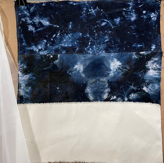
With an idea for what I was calling a "wave" quilt, I layered plain white silk organza over a hand-dyed deep blue velvet after adding a canvas panel to the bottom, reminiscent of sails and outdoor canvas tote bags, and stenciling a poem on the canvas.
I stitched away happily, a sashiko wave at the bottom, and machine sewn waves at the top. Then I slashed. And discovered that it did not work at all. Because I was unsure, I showed it to a couple artist friends. They weren't getting it, either.
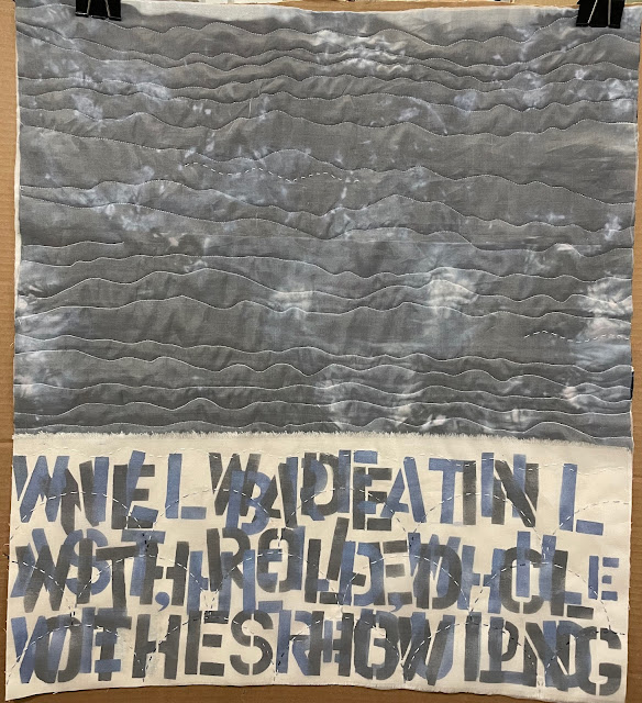 *
*Here's what I think happened: the formerly white organza now read as gray, not as white waves.
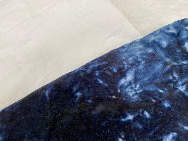
Was there movement? I thought so. But it was mostly horizontal movement. And the split between the waves and what I imagined the canvas to be, the sand, was too stark. Too much contrast. Again, that is not what happens on the beach. The sand is different colors, dark as it is wet close to the water, and lighter and dry when it is farther away. Of course, it could all be very abstract, but the problem was it didn't read like water or sand at all. It just looked disjointed. My meaning was not coming through.
I tried a variety of potential saves, like adding pieces of rope that would help the vertical and tie materially and thematically into the canvas, but ultimately, I deemed the quilt a fail. It wasn't getting better.
I was sad about the dyed velvet, as it was a favorite piece of cloth. Then I began the distraction project of the eyeglass cases, and realized I needed more batting scraps. I eyed the failed quilt. I made friends with my seam ripper and saved out the batting, my beloved velvet, and the white cotton backing.
Another case of a vision in one's head that doesn't translate to one's hands. It was time and a lot of work, but I accept the outcome. Even when I am disappointed I always learn something, and I did get to explore an interesting new book for ideas. I was reminded that it was okay to let a project go.
On to the next one.
Comments